1. Getting Started
2. Template Structure
Neon requires that body to have the "page-body" class, so this is mandatory.
Inside the body you should apply this main markup structure:

Or in the case if you use Horizontal menu layout:

And if you use both menu types then it should start like this:

The markup above is mandatory, so you have to put your markup inside this structure.
3. Layout Configuration
To see all options that Neon Layout offers, refer to this link: http://themes.laborator.co/neon/layouts/layout-api/
3.1. Sidebar Left
3.2. Horizontal Menu
3.3. Both Menus


4. Setting Up The Menu

5. Extending the Theme
This is the most important part of the theme documentation, because you will learn how to dig deeper in the theme and get it better. Apart from other sections, they all have files to see the live demonstration, but here you will learn how you can extend this theme.
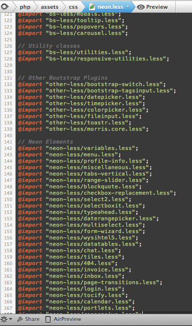
5.1. Styling
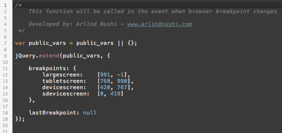
5.2. Scripting
6. Other
6.1. Chat

7. Credits
Neon wouldn't be this great if the staff of Laborator, Arlind Nushi and Art Ramadani wouldn't be part of this project, neither without the presence of these great plugins, graphics and other resources:
- Twitter Bootstrap
- jVectormap
- Morris.js
- jQuery Sparklines
- Rickshaw
- FullCalendar
- Google Webfonts
- SlimScroll
- Nice Scroll
- Toastr
- Knob
Visit our official webiste for more Themes, Templates and Plugins - www.laborator.co